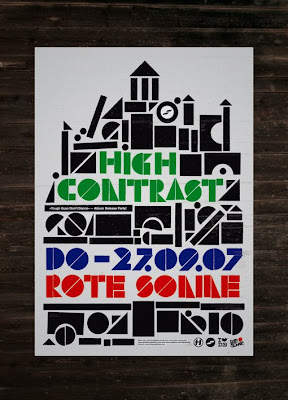
A poster for High contrast by Purple Haze Studios. Comprised of simple geometric shapes, and I think its simplicity really pushes the aesthetic of this poster. It was probably screen printed as well with a three colour seperation.

Poster by One- Two. I found one two in a book I bought at the book fair in the mosaic bar at uni, Im keen on the layout of this poster, It may be a little cluttered in places but i like the way it looks and also its finish. I think this poster has been screen printed and I would also like to screen print at least some of my outcome.

front cover for frank welcome pack. i really like the finish of the cover of this fold out and its something I think i should be working towards.

Screenshot for the frank welcome pack I like this in terms of its layout and use f limited colour.

A year planner I found on the internet. I presume its quite large!

A screenshot of a welcome pack for frank. I like fold outs and would like to produce something similar in size.
 A poster for High contrast by Purple Haze Studios. Comprised of simple geometric shapes, and I think its simplicity really pushes the aesthetic of this poster. It was probably screen printed as well with a three colour seperation.
 Poster by One- Two. I found one two in a book I bought at the book fair in the mosaic bar at uni, Im keen on the layout of this poster, It may be a little cluttered in places but i like the way it looks and also its finish. I think this poster has been screen printed and I would also like to screen print at least some of my outcome.


No comments:
Post a Comment