Showing posts with label OUGD103. Show all posts
Showing posts with label OUGD103. Show all posts
Thursday, 28 May 2009
1. What practical skills have you developed through this module and how effectively do you think you have applied them?
For definate, my professional practise has greatly improved and just my idea of what I should be doing in order to solve a problem, I think my use of research has really started to develop into a skill recently as well. My time management is ever improving and I havent felt like things have been gettin on top of me at all during this module. I also think my social skills have improved, as I feel I can now go up to anyone in the year group and ask for help/an opinion. I think it's that that's benefitted me most this module to be honest.
2. What approaches to/methods of problem solving have you developed and how have they informed your design and development process?
I have taken heavily to working on design sheets and not so much the sketchbook over this module, especially speaking from experience and I have found that working in this way helps me rapidly build up a body of work then of which I can be selective about in order of relevance. I also feel that I am taking a more practical and logical approach to problem solving in general in the means of the order I am doing things in. My hap hazard way of working is slowly being beaten out of me! which is ace.
3. what strengths can you identify in your work and how will/you capitalize on these?
I think a definate strength of mine is my illustration and layout but- the way I want to capitalize on this is by not using illustration so much - or translating these strengths typographically. Another way I want to capitalize on these strengths is by using manual print methods and other fors of surface print and hands on disciplines instead of being restricted to a screen and an inkjet/laser.
Another strength of mine that I have noticed recently is my appreciation for materials and how to use them. Next year I definately want to do my research - and get my hands on some really nice stocks and materials. I can capitalize on this one by just stocking up on stuff and collecting like i did at the start of 1st year, but with a pracitcal and informed point of view.
4. What weaknesses can you identify in your work and how will you address these more fully?
I do think im quite stubborn at times, i need to stop being as personal as i am with my work and more objective. I mean, im definately improving, but there is room for alot more improvement!
I think Im lazy too, after Ie done alot of work i seem to stop being bothered - which I want to kick up the arse in second year and totally weedle out - Im a hell of alot better than I was and im constantly learning new ways of dealing with projects but I want to be alot more active than i currently am.
5. Identify five things that you will do differently next time and what do you expect to gain from doing these?
1. fully engage and look at a problem from every angle - by doing this i would build up a bigger body of work which would be better in terms of content and probably aesthetic and produce much more professional pieces of work.
2. collect and stock up on materials - by having a library of stocks and materials I could potentially become allot more time effective and also have more to experiment with.
3. find more research sources - by finding more I would have a more widely informed topic, subject and aesthetic to deal with when embarking on a project, which would help push my design further.
4. Engage with the people around me! - I started to do this towards the tail end of the module and started to benefit from it.the group's opinions are just as valid and as good as mine, and when these ideas merge, good things happen!
5. keep stepping further out of my comfort zone, I have been using alot more type in this module than i did before and i think this is improving my work greatly, I want to look into things I previously wouldnt have acknowledged and help myself push my design!


These are the final outcomes for "Speaking from experience." Im really happy with the end result, despite some minor flaws. I think my primary research really helped push this project in the right direction and my secondary research helped inform the design in terms of size, layout and aesthetic. This project ended up being a mostly aesthetic talking point responding to the problem " who wil be on my course and what will they be into?"
Each pack contains :
- 1 A2 poster "Into Bagd"
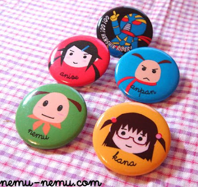
- 6 button badges with imagery from the poster on them
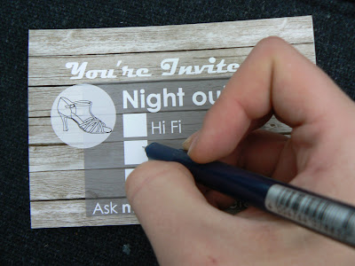
- 3 invite postcards.
I designed and produced this because it is something I would have liked to receive and keep as a momento of my first day, and if i produced 55 of them (which isnt feasable - it would cost about £238 to do so) people would keep them because of the content, tone of voice and quite professional finish. This is easily the best thing I have produced on this course so far.
poster and badges
Im really happy with how this is looking and im also really happy with the logo. 
I took vectors from the poster and sized them down on illustrator in order to fit onto badges. the badges were 35mm in diameter ( this is how big i had to cut the paper) Then I had to leave a 10 mil border around the image ( the image had to fit into a 25 mm diameter) This was to allow space for the badge to wrap around. I messed up a few times, but it was too fun! I produced 12 final badges (6 assorted sets) in each pack made (2). The badges are one of my faourite parts of the pack and Im happy with how they have ended up looking.


The poster is A2 (screenprinted on handmade stock). I did a run of 6 and used 2 in the final packs.

I took vectors from the poster and sized them down on illustrator in order to fit onto badges. the badges were 35mm in diameter ( this is how big i had to cut the paper) Then I had to leave a 10 mil border around the image ( the image had to fit into a 25 mm diameter) This was to allow space for the badge to wrap around. I messed up a few times, but it was too fun! I produced 12 final badges (6 assorted sets) in each pack made (2). The badges are one of my faourite parts of the pack and Im happy with how they have ended up looking.


vectors i used to illustrate from research
I did a survey on facebook and also asked around the class about peoples interests...
"give me one interest thats bagd based, and one that isnt"
The response was very varied and included things like sci fi, loud noises, football, type, music, eating, smoking, gaming, photogrpahy, paper stocks the list goes on... put heres some og the jpegs i collected to turn into vector imagery.

"give me one interest thats bagd based, and one that isnt"
The response was very varied and included things like sci fi, loud noises, football, type, music, eating, smoking, gaming, photogrpahy, paper stocks the list goes on... put heres some og the jpegs i collected to turn into vector imagery.

sfe bag + logo explaination
 Ok i chose to go with the logo into bagd because it was something most of us found remotely amusing on our first day, and I wanted to play on that idea because the whole point of this pack is to act as a talking point, it doesnt particularly matter if its "hard to say" because thats the point.
Just wanted to get this up on here was well, screen print onto plastic, get in!

developmental boards, sfe


Some of the boards I made for the speaking from experience brief. The idea I decided to go with was producing a welcome pack wich contained talking points and ice breakers for next years first year. I wanted to produce something which would make the social side of life a little easier for next years first years whilst in the uni grounds.
I have started developing a poster, badges and some invite postcards.
Speaking form experience research - posters and foldouts
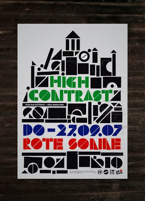
 A poster for High contrast by Purple Haze Studios. Comprised of simple geometric shapes, and I think its simplicity really pushes the aesthetic of this poster. It was probably screen printed as well with a three colour seperation.
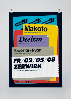
 Poster by One- Two. I found one two in a book I bought at the book fair in the mosaic bar at uni, Im keen on the layout of this poster, It may be a little cluttered in places but i like the way it looks and also its finish. I think this poster has been screen printed and I would also like to screen print at least some of my outcome.
Subscribe to:
Posts (Atom)


